
A Decade-Long Icon Change Finally Arrives
For the first time in 10 years, Google is refreshing its famous ‘G’ icon. Back in 2015, the company last updated its logo, switching to a sleek, modern design called Product Sans. At that time, the lowercase ‘g’ on a blue background transformed into the colorful, circular icon we recognize today. Now, Google is giving it another subtle but vibrant upgrade.
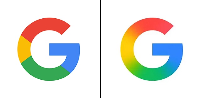
Instead of keeping the four solid color blocks, the new design blends them smoothly. The red now fades into yellow, the yellow into green, and the green into blue. This creates a more dynamic and lively look. Interestingly, the gradient effect matches the style of Google’s Gemini AI and the AI Mode in Search.
Where You’ll Spot the New Look
Already, the updated ‘G’ icon has rolled out in the Google Search app for iOS after a recent update. On Monday, Android users also saw the change in the Google app’s beta version (16.18). Since the difference is subtle, you might not notice it right away—especially if the icon sits on your home screen. As a tiny favicon in your browser, the change is even less obvious.
For now, Google isn’t altering its full six-letter logo. There’s also no confirmation whether other product logos, like Chrome or Maps, will get similar gradient treatments. However, since many of these logos also use the four-color scheme, they could easily adopt the blended look in the future.
This small but meaningful update keeps Google’s branding fresh while staying true to its playful, colorful identity. Keep an eye out—you might just spot the new ‘G’ popping up in more places soon!